Colorful Day
Quick drafts of colorful UI designs for a weather app.
Year
2024
Team
Developer x 1; Designer x 1 (me)
Project Type
UI/UX Design Discovery
Project Deliverables
A set of UI drafts for the developer to use as reference and visual guide, focusing on color exploration and style.
How the project started
A friend of a friend (the developer) is a college student and is looking into making his first smartphone app; when he mentioned how he hasn't been satisfied with the UIs he made in Android Studio, I offered to draft a set of UI drafts to get him started on his attempt at making a weather app. He sent me a few inspiration images of which he liked the style of.
Some further specifications/requirements from him was that he wants to keep using the 3D-rendered weather graphics; he also asked for a landing page that goes before the actual weather screens.


References I received
I have no knowledge in 3D modeling and rendering images out of 3D objects; I needed to look for resources for the screens since the developer requested imagery in styles similar to the reference screens and I can't make any. Some quick search among shared community files in Figma led me to this set of 3D-rendered weather icons.
Not much instructions or limitations was given for the rest of the design so I wanted to make some designs that are bold and able to establish an image quickly, while being not actually complicated to implement.
Iterations
I drafted a few screens as the initial jumping-off point for the developer to take a look.

Sunny, day

Sunny, night

Rain, day

Rain, night

Windy, day

Windy, night

Snow, day
At this point, I sent this first batch of screens to the developer for review, even though I haven't finished the night version of "snow" yet. Quick iteration and frequent communication means quick turnover and frequent feedback; the developer didn't like the color scheme for the Snow, Day screen; at this point I haven't finished working on the Snow, Night screen yet.
I talked to the developer regarding why he didn't like the Snowy colors; the reason he gave was that it looked "muddy". That, to me, translated to that the colors used were not of a obviously distinctive hue (the colors used in the Snow, Day screen above contained different degrees of grays). As an iteration, I made the following screens with some new colors.

Snowy, day, version 2

Snowy, night, version 2
The version 2 of snowy day/night designs still seemed to miss the mark. You can see in this version (above) I went for a more colorful, more saturated palette. Since this was not a satisfying design, I went for the opposite, a less saturated palette (version 3, below); I understood that while in many media and artwork pieces snow is associated with icy blues and crystal turquoises, in real life where the weather happens, it very much might not be the case.

Snowy, day, version 3

Snowy, night, version 3
The developer liked this palette a lot more, but wanted a different snowflake icon. I suggested that I was not not able to find many other high-quality icon sets to use as alternatives plus introducing one single icon from another icon set would cause more inconsistency overall; the developer insisted, so for the final version of the snowy day/night screens, we used the snowflake icon as showed below from this other 3D icon set.

Snowy, day, version 4

Snowy, night, version 4
I also added 2 more screens for foggy day/night, adding up to a total of 5 different weathers.

Fog, day

Fog, night
After some further review with the developer, the following 10 screens are the final designs for these five weather conditions:
The final 10 weather screens
The Settings Page
For the Settings pages, the developer specified that he didn't want anything complicated and only wanted the essential items:
Changing temperature units
Changing time format
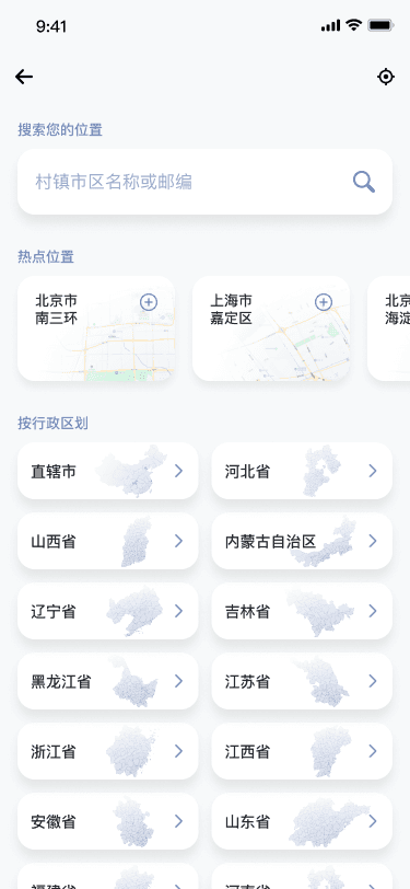
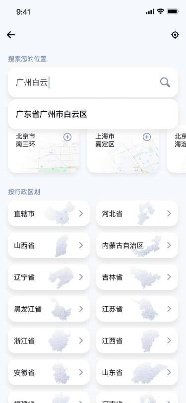
Selecting and changing forecast locations
Privacy/data collection policy
User agreement
About the app
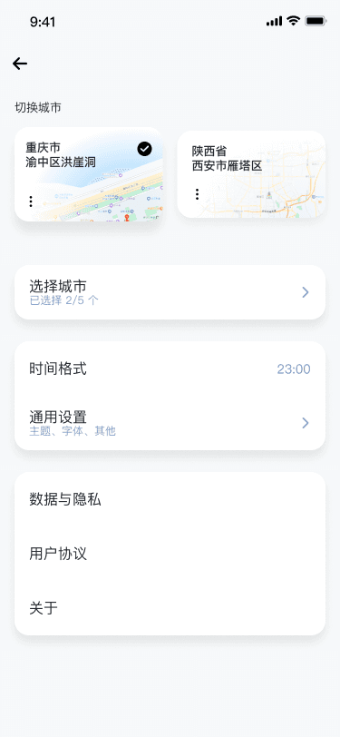
The lack of an "account" option is because we agreed that we want this app to be account-less, i.e. the user can download the app and start using it without creating an account or setting up a profile. I made the following screens as discussed.

Settings page

Settings - select forecast city

Settings - select forecast city - search in focus

Settings/Select location user flow
Defining the palettes
The following are the final palettes we used in the final design.

The final color palettes
How the palettes are made
Same Brightness, Varying "Brightness"
I used Scale by Hyak (https://hihayk.github.io/scale) to generate the gradients. Different from using it in the BilibiliAS project, these palettes involve multiple hues, meaning one very important consideration need to be made: in a HSB (Hue - Saturation - Brightness) color model, different hues at the same brightness value can have drastically different visual appearance. For example:

An example of four colors with the same Saturation and Brightness values while Hue values are all different. While all having a Brightness of 98, the green (2nd color) and fuchsia (4th color) seems "brighter" than the watermelon red (1st color) and medium periwinkle (3rd color).
This nuance means certain adjustments in overall brightness and saturation across the whole series of colors in a gradient is necessary. Methods such as what's suggested in this article (https://medium.muz.li/natural-color-palettes-7769e5b38ecd) by Sam Gordon is very close to what I did to create the gradients, except that other than the purpose specified in the article, I focused more on visual harmony (because these colors will mostly be used - individually or in a dual-color gradient - as background colors) and contrast (contrast against white, black, or colors on either ends of a gradient series, aka the darkest or the brightest).
The following are the two sample gradients are made in Scale.


Generating gradients for "Windy, day" and "Fog, night"

De-saturated screens showing how the background gradients for Primary, Secondary and Tertiary cards are formulated in relation to their informational significance and the relative contrast against each other.

