BilibiliAS
Redesigning the UI for BilibiliAS, an open-source video downloader for Bilibili.
Year
2024
Team
Developer x 1
UI/UX Designer x 1 (me)
Project Type
UI/UX Design (Mobile) Interaction Design User Research
Outcomes
User research to identify existing problems within the current version of the app, and targeted solutions for said problems.
A complete set of refreshed UI, including several overhauled major interactions, iconography, color scheme, improved UX copywriting, and corresponding localization.
Introduction
Similar to YouTube in nature and started as a domestic version of Niconico, one of the most famous Japanese pop- and subculture website, Bilibili (哔哩哔哩) is a Chinese video-based UGC platform. Rooted in the fandom around Japanese pop culture and sub-culture such as Anime and Manga, Bilibili started as a niche website for hobbyists, eventually developed into what it is today, where almost anyone could post their content about almost anything. Given its wide coverage of various topics, large amounts of original content, relatively low bar of entry, and its high popularity among younger netizens, many users have the need of saving certain contents, especially videos, from Bilibili. BilibiliAS is an open-source media downloader made to meet such needs.
Inside a Bilibili Video Post
Bilibili Video posts are structured akin to YouTube videos. The only additional parts are the Danmaku file and the subtitle file, for each video.
Multi-episode video posts however are different from how a YouTube video can have multiple "chapters". Chapters are sections of one video, but "episodes" in Bilibili context are separate videos, therefore a multi-episode video post is effectively a collection of videos, each episode having its own Danmaku and subtitles.
Problems in BilibiliAS's Existing UI
After doing an in-depth audit of BilibiliAS's existing UI, I identified many problems with its existing UI. The following categories covers the majority of the more significant issues:
Confusing user flow. This has been a major complaint from many users (see user research for more on this); users was not happy with (1) the login flow and (2) download flow, which are both crucial for the app to appear useful and functional to the user.
Low affordance copywriting. Feature labels such as "Select from Webpage" (网页解析, which literally should be translated to "Analyze Webpage") and "Log Export" (日志导出) do not help the user, especially first-timers, understand what these features do and how to use them. I suspected that these two features suffered from reduced utilization simply because of the confusing naming, and this was indeed confirmed in the first user research.
Many layouts do not make sense from an information- architecture/usability perspective. Some of the most obvious problems in this category are:
placement of the Settings button;
usage of the tab bar;
layout of the home screen;
layout of the download options menu.
Incomplete localization. While Bilibili is a Chinese website and the majority of users of BilibiliAS don't need English localization, from the perspective of usability and product quality, this can be improved upon.
Ineffective use of icons. This happened across the app with the old UI.
User Flow Analysis
I created the following diagram to illustrate the app's user flow based on its existing UI.
Click on the image to view full-screen in a new tab.
User Research: Survey #1
I put together the first user research questionnaire. The main objectives of this survey are:
To verify if the "Select from Webpage" and "Log Export" features suffered from their confusing naming.
To get a general and primitive understanding of user engagement and their existing main complaints (since this is the first ever user research activity conducted for the app).
Click on the image to view full-screen in a new tab.
A link to the questionnaire was posted at the following locations in order to increase outreach and engagement:
one of the landing screen carousel cards in the app;
within BilibiliAS's Tuxiaochao user feedback group. Tuxiaochao is a user feedback and community system focusing on the Chinese domestic market, made by Tencent; its functionality is similar to UserVoice.
Within 2 user chat groups each with 300+ members on QQ. QQ is a Chinese instant messenger system similar to Discord.
I translated the questionnaire screenshots from Mandarin to English.
We were unable to offer meaningful compensation for survey participants therefore a major goal for me creating this survey was to keep it short, to-the-point, yet enough to reveal the user's true understanding and expectation.
Survey 1 Results and Analysis
Survey 1 was open to responses from July 25 to Sept 18. I got a total of 106 responses. The survey result infographic is attached (to the right).
Click on the image to view full-screen in a new tab.
One of my attempts at trying out new ways of survey-based user research was I tried to implement logic-based selection branches and questions. I implemented the logic flow between question 3, 4, 5, and 6 so users who don't even remember a certain feature don't have to answer what they have done with said feature, however I did not know for sure if the implemented question logic worked as I expected.

As shown in the infographic image above, I manually distilled short answer questions (6, 7, 8) because each response is unique and there was no correct/expected answer. I went through every response these questions received and summarized them based on the major shared points of information; these points are listed as the grouping buckets for each of these 3 questions.
Insights I gained from this survey are:
The naming of "Select from Webpage" and "Log Export" were confusing. Renaming is required to make these two features seem useful.
Renaming the two features above will work better with refreshed UI design. The new UI design needs to take into consideration the utility/QoL improvements requested in Question 8, such as downloaded file format conversion, quick download from copied links, improved download task management, file management, and so on.
From the development perspective, more focus and more frequent updates and bug fixes are required.
Users would like to have a UI update; several written comments mentioned how the existing UI felt dated, rough, primitive and lacks polish.
User Research: Survey #2
For the second survey, my goal was to better understand existing user case scenarios and how the users use the app, thus there are fewer questions in the questionnaire, but each one of them were more complex, intending to get deeper insights into the real-life use cases.
Click on the image to view full-screen in a new tab.
Survey 2 was open from Sept 4 to Nov 14, 2024. I received a total of 84 responses.

Survey 2: Results and Analysis
Compared to survey 1, this survey got me the insight I wanted, but it was less optimal on other aspects. Judging from how participants answered the two scale-grid questions (rating their likelihood of downloading every type of content/files when single-episode/multi-episode posts are considered), the 1 to 10 scale seemed unnecessary, where most scores aggravated towards 0, 5, and 10 points. Another reflection is that, although separating single- and multi-episode Posts seems logical, users don't actually think about the "types" of posts distinctively; they see them all as Posts containing things they want to save. Therefore, retrospectively, I should have structured this question as "rate the following options from the most likely to the least likely that you'd want to download" followed by the same set of options.

In summary, the second survey showed:
Slightly less than half of the participants usually only interact with a Post link and content/files downloaded from the link once. "Interact" here specifically refers to downloading content from a pasted link and/or deleting anything that's been downloaded.
At least 34% of participants would benefit from the ability to easily access a Post they've downloaded before.
Typical user download behavior varies drastically for multi-episode Posts.
For single-episode Posts, > 50% of the participants reported that they always download regular videos (aka videos with audio); each downloadable component of a Post has at least 15% of participants mentioning they always download each of them. Danmaku has the highest rate of "never download" and is likely the least needed, with audio without video being the second. Audio without video has the highest rate of 5 points, making it the type of file that's the most dependent on what the video is.
Numbers for multi-episode Posts are mostly similar to those for single-episode Posts.
The short-answer question revealed a few pieces of information:
Even within a user group like BilibiliAS's where age and technology familiarity vary less than many other apps and most users are relatively young, some users are not exactly tech-savvy. 15 answers (17.8%) in the categories of new feature requests and unresolvable technical showed these users don't understand how video/audio extraction from media streams work, or the fact that certain things are impossible due to API/paid access limitations of Bilibili.
A total of 17 answers (20.2%) directly or indirectly showed frustration with bugs in the app and the slow updates. From this perspective, the new UI/UX needs to help increase the app's resilience towards sudden API changes/unexpectency on Bilibili's side, onboard new users quickly, and improve accustomed users' interactive efficiency.
The New Proposed UX
Onboarding: Old v.s. New
The following are a screen recording of BilibiliAS's current login flow (left) and a recording of an interactive prototype of my updated login flow (right). As of writing of this case study, the Cloud Login feature is still under development, so the prototype still showed the QR code login method. Other than UX improvements, the updated login flow also features Material You style refreshed UI, clean colors, and highly legible text.
Existing onboarding flow
New onboarding flow (prototype)
Refreshing the Search and Download UX
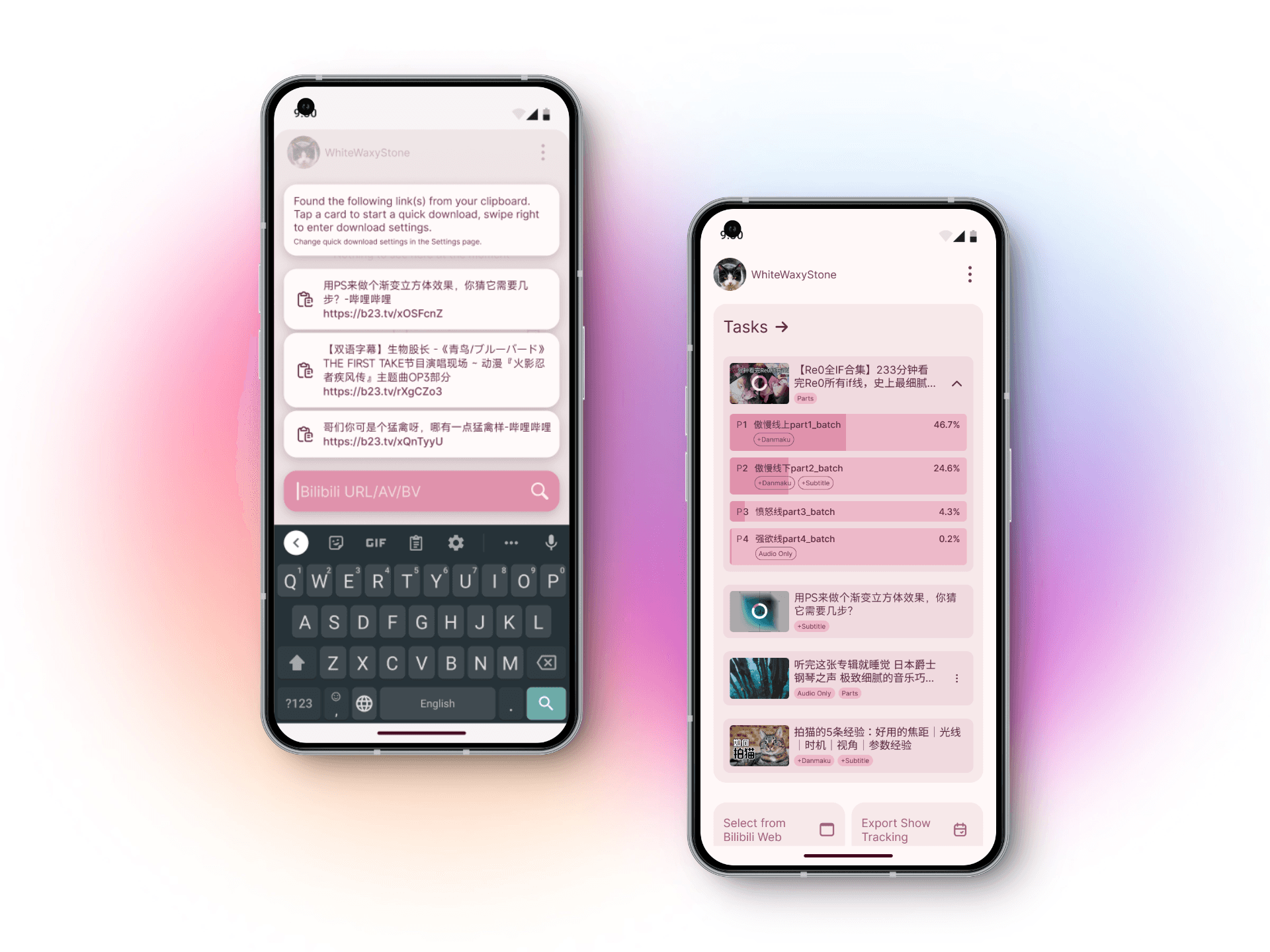
The new home screen (1) no longer uses a tab bar and (2) provides a much clearer view of the main features of the app. In the existing UI (left 2 screens below), the tab bar separated different groups of features albeit not very sensibly, thus my redesign aimed to re-group related features while maintaining the visibility of non-functional sections such as "announcements" and "release notes". With the new design, the primary feature of the app - saving contents from Bilibili by pasting a link - gained front-and-center visibility. 网页解析(Analyze Webpage - "Select from Bilibili Web") and 日志导出(Log Export - "Export Show Tracking") have also been renamed as suggested by user survey 1 results.
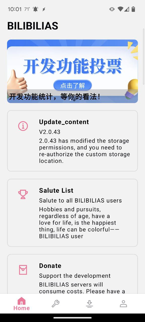
Existing home screen

Proposed home screen
Download Interaction - Tap: download in one action
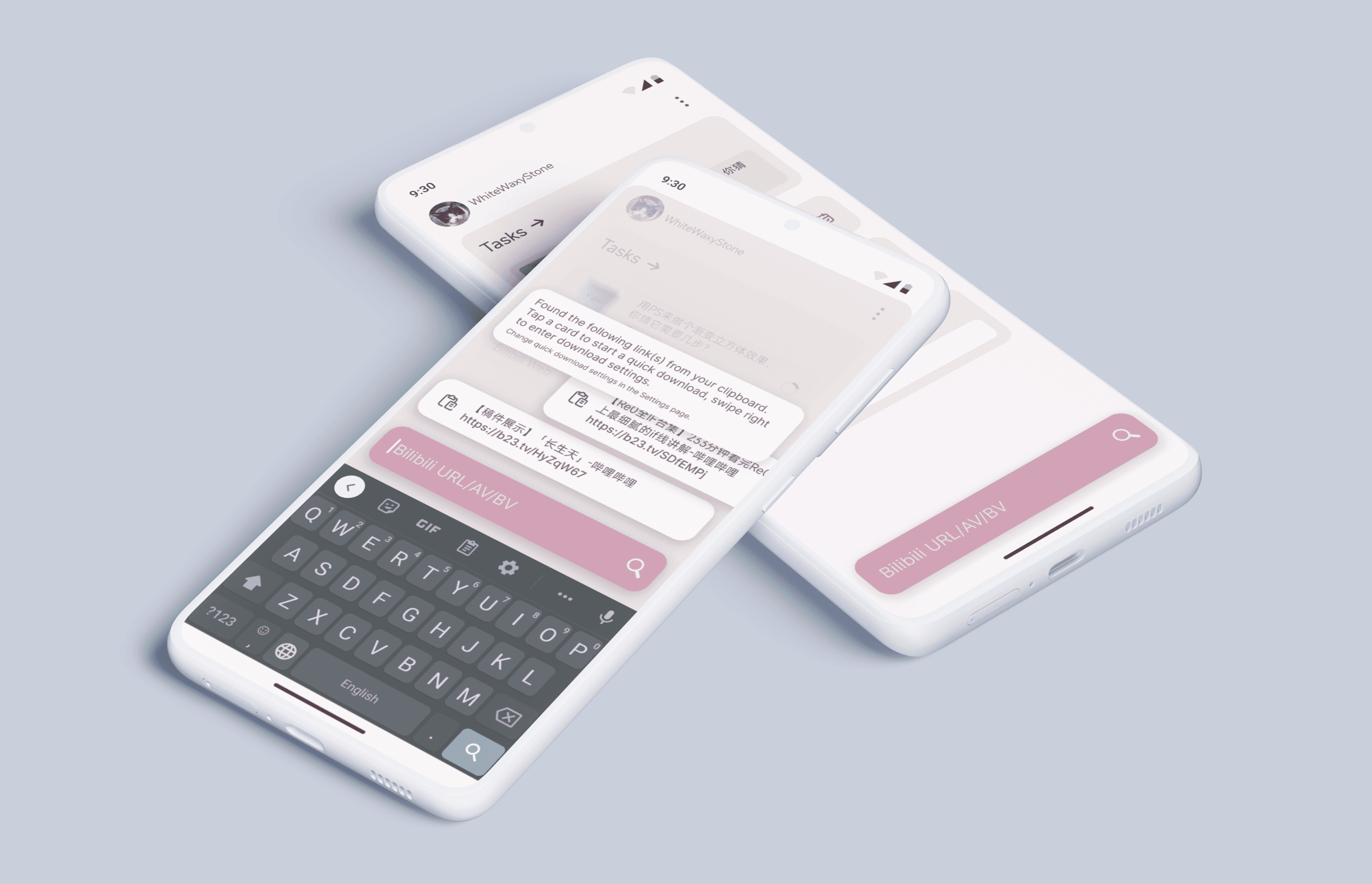
After making the "where" (to paste a link) clear, I introduced some new UX to the search-download flow. One of the steps in the onboarding process was asking the user to give the app clipboard access; with this, BilibiliAS could read clipboard content, identify Bilibili post links, and show the posts as cards of savable items, without the user having to pasting them into the app one by one.
In the case where the user did not allow BilibiliAS to read from their clipboard, they can still copy links then manually paste links into the app to save content.
Tapping a link card
Download Interaction - Swipe: fully customize then download
User Survey #2 revealed that user needs vary greatly depending on content of the post and what each user would like to save; we also discussed how from the user's perspective, convenience is the primary consideration; this is why I wanted to add the "swipe" interaction along the regular "tap" interaction to the cards. The goal of introducing this interaction is to make download customization accessible with low interactive cost without affecting the Quick Download interactions.
The image below is the existing UX for selecting one or multiple episodes within a post. User Survey #1 suggested that this is a big pain point for users; many users didn't see or notice the "download subset" (下载子集) item, or didn't know that it's an interactive item, then commented/suggested that the app can't download multi-episode video Posts.
Swiping on a link card
The Task List
Ongoing tasks: keeping statuses visible
The new UX allows the user to easily get a glance of statuses of the most recently added tasks, including Post title, download progress, types of files being downloaded, and so on without going into the full task list. The old UX limits this information to its own tab and lists the download of every file as its own task, even when several files are all from the same part of a video post.
Existing download task list
New download task list (in home screen)
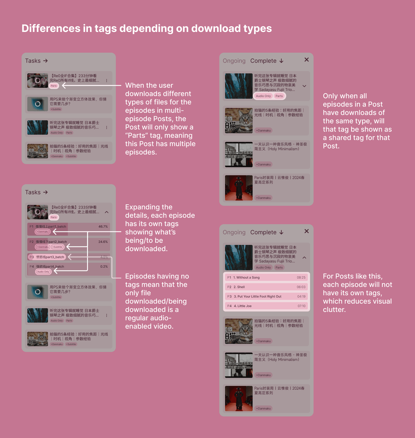
Tags: where & when they appear
Placements of tags went through several iterations as I worked through the design and posted in-progress screenshots to ask for comments in our user groups. The image below as well as the Task List and States video both provide demonstrations of how tags would work.
A diagram explaining how tags work
Navigation within a multi-episode Post
The diagram below showed how the users navigates between different episodes within a multi-episode Post. This UX, other than being (1) so unnoticeable that many users' feedback showed that they didn't even know the app allows them to download episodes other than only the first, or multiple episodes in the same post together, (2) no longer available once a download task(s) is created from a pasted link - to reach this episode selection UX again, the user has to paste in the same link and have the app find the Post again. A demo video in the next section showed how the new navigation is designed to work at all times within a multi-episode Post.
A diagram explaining how tags work
Accessing a post after the initial download
In the current UX, once tasks are added from a post (to the user, "a post" typically equals one link they copied from a Bilibili video post), BilibiliAS doesn't provide any measure for the user to see or get the remaining files; to see or get these files, the user must paste the same link again. For the user, this means (1) for a multi-episode video, if initially the user only downloaded certain files of certain episodes, unless they still have the link to that video post [retained in clipboard or saved somewhere else], they have to open Bilibili, find that post, copy the share link again, open BilibiliAS, then finally become able to see other episodes and download other files from those episodes; (2) the same high-interactive-cost process remains for users wanting to download OTHER files of the same episode they had downloaded file(s) from - e.g. the user downloaded Danmaku, and later wants subtitles; downloaded regular video, and later wants the audio track.
Updating the Settings page
I also refreshed the Settings page. Below are a screenshot of the existing Settings page (first) and the updated Settings page (2nd and 3rd). Communication with the developer confirmed that the items in Settings don't require any major changes; the updates are mostly visual with full localization and other minor legibility improvements.


UI Showcase
The following is a collection of new UIs. Go to the previous/next image by the Left/Right buttons below the carousel, or by swiping left/right across the images.
Defining Colors
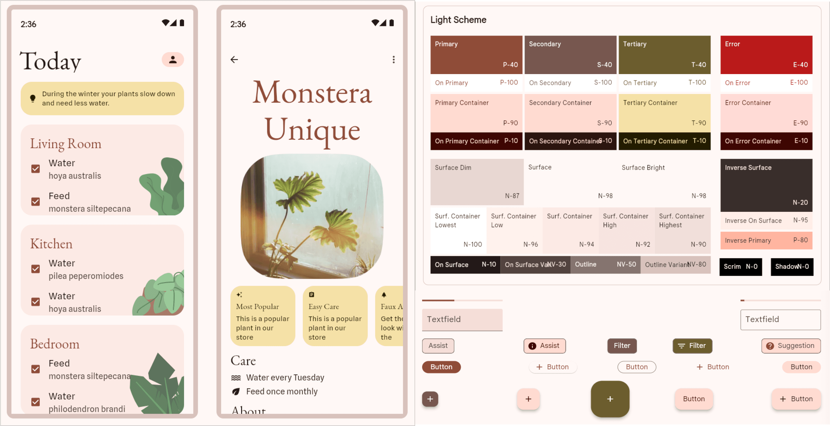
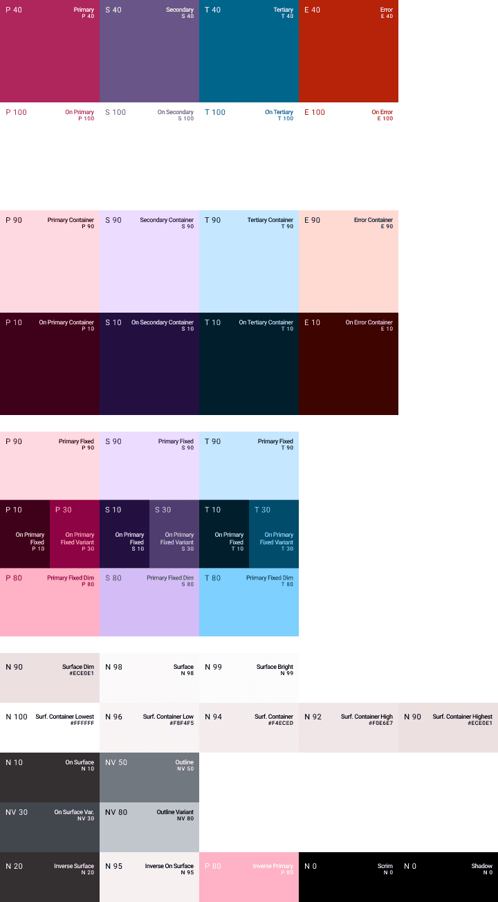
Designers use many different methods to decide on what colors to use in their interfaces and especially name the colors. For this project, I wanted to combine Figma color variables, design token methodology, and the new Material You color scheme newly introduced to Android. The first step of defining a color scheme is to define the actual colors. For this I started playing with Material Design's official theme tool (https://material-foundation.github.io/material-theme-builder/). I also found this article (https://www.bilibili.com/opus/779316245518352390) for some color codes as references.
A screenshot of sample screens, a color palette using MD3's new methodology, and some components, in the Material Theme Builder. The screens showed how primary and tertiary colors are used at the same time.
After imitating a Material You color scheme and making something similar (on the right) based on Bilibili's brand colors from the article above, I had the following thoughts:
BilibiliAS is an app made only for Bilibili, and Bilibili has a defined brand color (pink) and corresponding UI-oriented colors.
BilibiliAS's new design contains many customized and unique UI components that are not conventional (conventional as in simple buttons, cards, pop-ups). As the sample UI in Material theme builder (place) showed, primary and tertiary colors were used simultaneously for different UI components; for BilibiliAS, I'm not sure this mixed usage will look the best, because BilibiliAS's visual hierarchy tends to go "deeper" (vertical, having more layers) than "wider" (horizontal, having more different types), in this case using colors of different hues (such as the primary and tertiary colors) may not look harmonious and may add to visual dissonance.
Most likely, BilibiliAS users will set Chinese as its display language. Compared to English alphabets, Chinese characters have considerably more visual weight; while they might take up less space than the same content in English, they benefit from decreased visual complexity of other elements on the screen.
First version of the palette
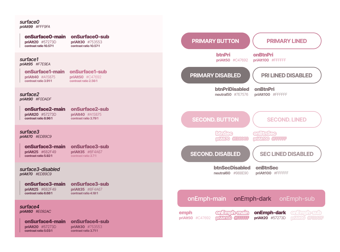
On top of that, another problem with this palette is that a few users suggested it's too pink - the pinks are too saturated. At the point these comments were given I already started working on some of the more detailed UI parts; "where will each color go" was becoming an increasingly prominent question. One thing I picked up from the MD theme builder was the monochrome gradients; this seemed to be a great way to limit random colors being introduced and keep the color references between variables intact. So at this point, I used Scale by Hayk (https://hihayk.github.io/scale) to help me generate gradient scales based on the Bilibili Pink and generate a set of less saturated pinks.
the initial primary, secondary and tertiary color gradients
Updated primary color gradients (with 1 extra color)
The final color palette
Icons, Old v.s. New
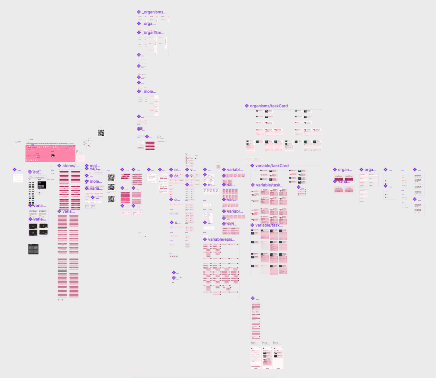
An overview of all components
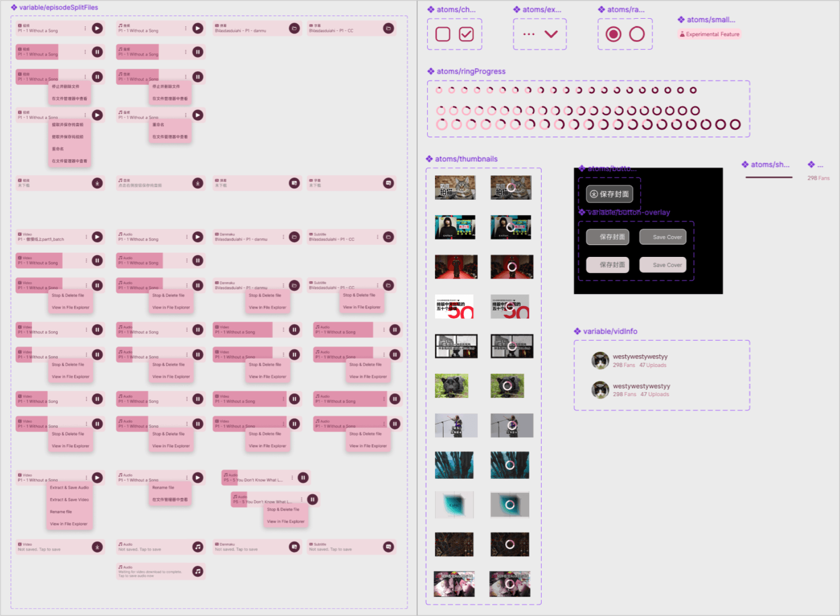
A closer look at a few component groups
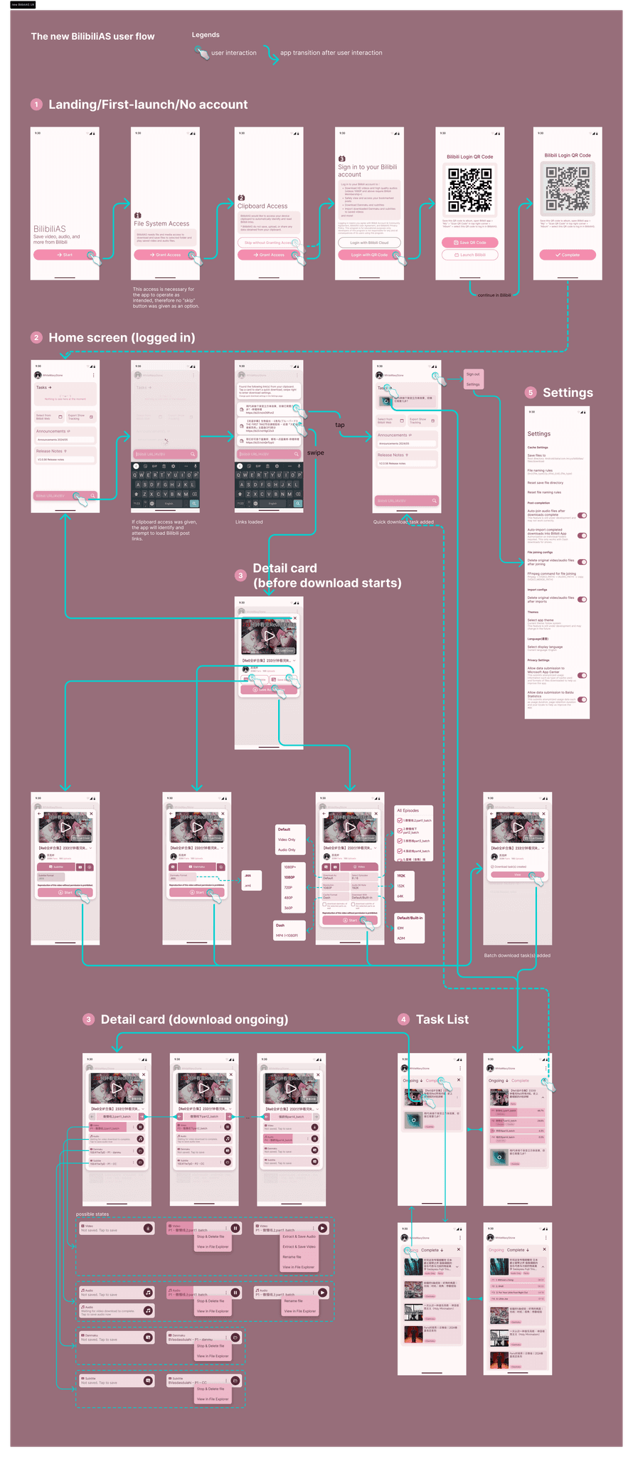
The new user flow
The following diagram shows the updated user flow of BilibiliAS with the new UI and redesigned interactive components and function groups.
Next Steps
Coming up, I need to:
Deliver all design documents to the developer in an implementation-ready format and allow access to the Figma design file. This is something I need to communicate with the developer before I start putting together the design handoff package, and the output will be very much subject to change as the implementation progresses. Due to the usage of variables, I should also communicate with the developer to see if design tokens are something they are interested in using, and what I should do on my end to make variables accessible to him in design token format.
After the implementation of the new UI is somewhat complete, if possible & conditions allow, conduct usability testing.
After the launch of a new version with the new UI, conduct a third user survey to further gather feedback from users on the new UI/UX; depending on the new insights gained from this new survey, further improve and iterate the app's experience.
Discuss and evaluate if any new items should be added to the Settings page depending on any newly implemented features, such as "a default setting for Quick Download tasks". This may be necessary to ensure the new UX and functionalities are supported to work as expected.
Reflections
Accessibility, especially color contrast and font scaling, is an area that I didn't pay sufficient attention to; I would like to make further improvements on this.
Dark mode. Considering that all colors used in this design are already made into variables, adding another mode to the variables would not be difficult; the selection of dark mode colors and fine-tuning of the final UI should take up more time if we were to proceed and add a dark mode.
Wrongful use of the app. BilibiliAS is a tool created to serve certain users' learning and archival needs, however we do not have any measure to help curb the usage of this app for bad and unlawful purposes, such as acquiring videos/audios and using/reposting them elsewhere without the permission of the original author's consent.
What is Danmaku (弹幕)
Danmaku as a Japanese word is figuratively translated to "Barrage" or "Bullet Curtain" and originated from conventional vertical scrolling shoot 'em up games, where bullets fly across the screen in dense groups.
According to Wikipedia, in 2006, Japanese video website Niconico "introduced a comment function which enables viewers to write comments on the screen for the video"; The comments shoot across the screen from right to left in a "bullet curtain" likeness, and "will be reproduced and displayed in accordance with the video's time axis thereafter".
Bilibili launched its own version of this feature around 2008-2009. In Mandarin, it's translated as Danmu. The major reason why this feature is so loved and became a mainstay in the subculture fandom is that many think "the combination of video and synchronous messaging creates a sense of community for the viewer".
About this case study
I completed the following tasks to create this case study:
User Research
Designing the questionnaires
Survey publishing and monitoring
Survey result distillation and cleanup
Infographic creation
Translation of all texts
Design Production (color palette, icons, components, screens, diagrams)
Visual Presentation (making case study assets, export, case study material selection)
Case study writing and revision
Case study page web design and production


