Project CADRE: Official Website & Query Interface
Creating the UI/UX for the official website and database query interface of Project CADRE
Year
2018 - 2019
Team
2 Web developers (1 full-time, 1 part-time)
2 Principal Investigators
2 Data Scientists
Project Lead (IUNI's IT Director)
UI/UX/Web Designer (me, part-time)
Project Type
UI/UX Design User Research Accessibility Web Design Graphic Design
Project Deliverables
A complete set of web and graphic design for the official website of the CADRE Project.
Draft designs of the CADRE system's UI for functional sections such as the user portal, query interface, and marketplace.
Introduction
What is CADRE?
CADRE stands for Collaborative Archive and Data Research Environment and is being developed by Indiana University Network Science Institute (IUNI) (https://iuni.iu.edu/) and Big Ten Academic Alliance (http://www.btaa.org/) led by Indiana University Libraries (https://libraries.indiana.edu/). CADRE strives to become a user-friendly research platform that provides sustainable, affordable, and standardized text- and data-mining services for licensed big datasets as well as open and non-consumptive datasets that are too large or unwieldy to work with in existing research library environments.
Author's Note
As of June 20, 2023, IUNI has announced that it would cease its operation on July 1, 2023. This decision is related to the passing of Mr. Valentin T. Pentchev, IUNI's IT Director, on New Year's Eve of 2022; Project CADRE was one of the several projects headed by him. I offer my heart-felt condolences to his surviving family. Find IUNI's public communication article on this matter here.
What I did in the Project
I conducted user research in the early stages to map out potential users' needs; the understanding gained through user research, combined with the development team and our in-house data scientists' insights, structured CADRE's MVP for the alpha launch. I also performed branding/visual identity design for CADRE as well as UI/UX design for both the actual functions of the platform and the landing website. This case study documents the web design portion of my work for this project; read about what I did on the branding/VI aspect here.
User Research
Collecting User Stories for an Abstract Problem
CADRE started off of a vague idea that something could be created to simplify bibliographical querying on massive academic datasets, such as the Web of Science (WoS) and Microsoft Academic Graph (MAG), and reduce the effort and time researchers and data scientists invest to obtain needed data in desirable formats. Yet, this is bound to be a hard-to-address and somehow wicked problem because our potential users are using these datasets for drastically different purposes, and their research approaches and toolsets are often times unique to their specific research topics; other subordinate factors such as purchasing different versions of datasets, data cleaning, and retrieving required data efficiently with a minimal amount of effort also easily add to the problem's complexity.
Under said circumstances, how do we figure out what our users' actual needs are? We started collecting user stories with a user story request drafted by co-director researcher-data-scientist, Xiaoran Yan:
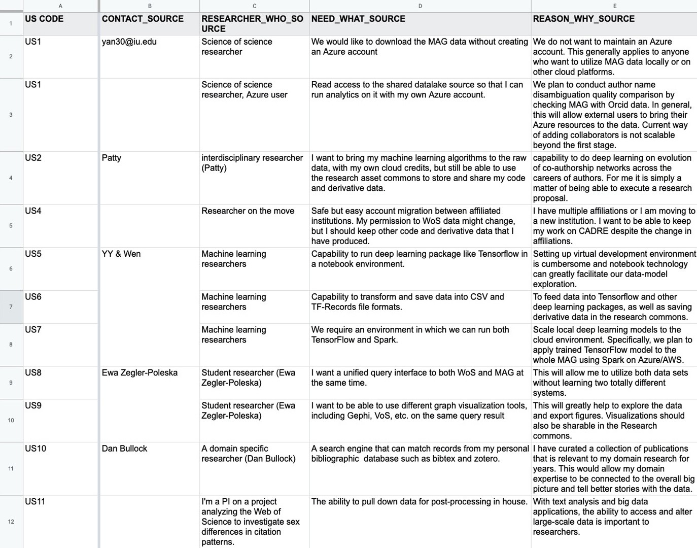
User story requests soon became the user story submission form on our website; I started documenting collected user stories with a excel table, following the structure of "WHO-WHAT-WHY":
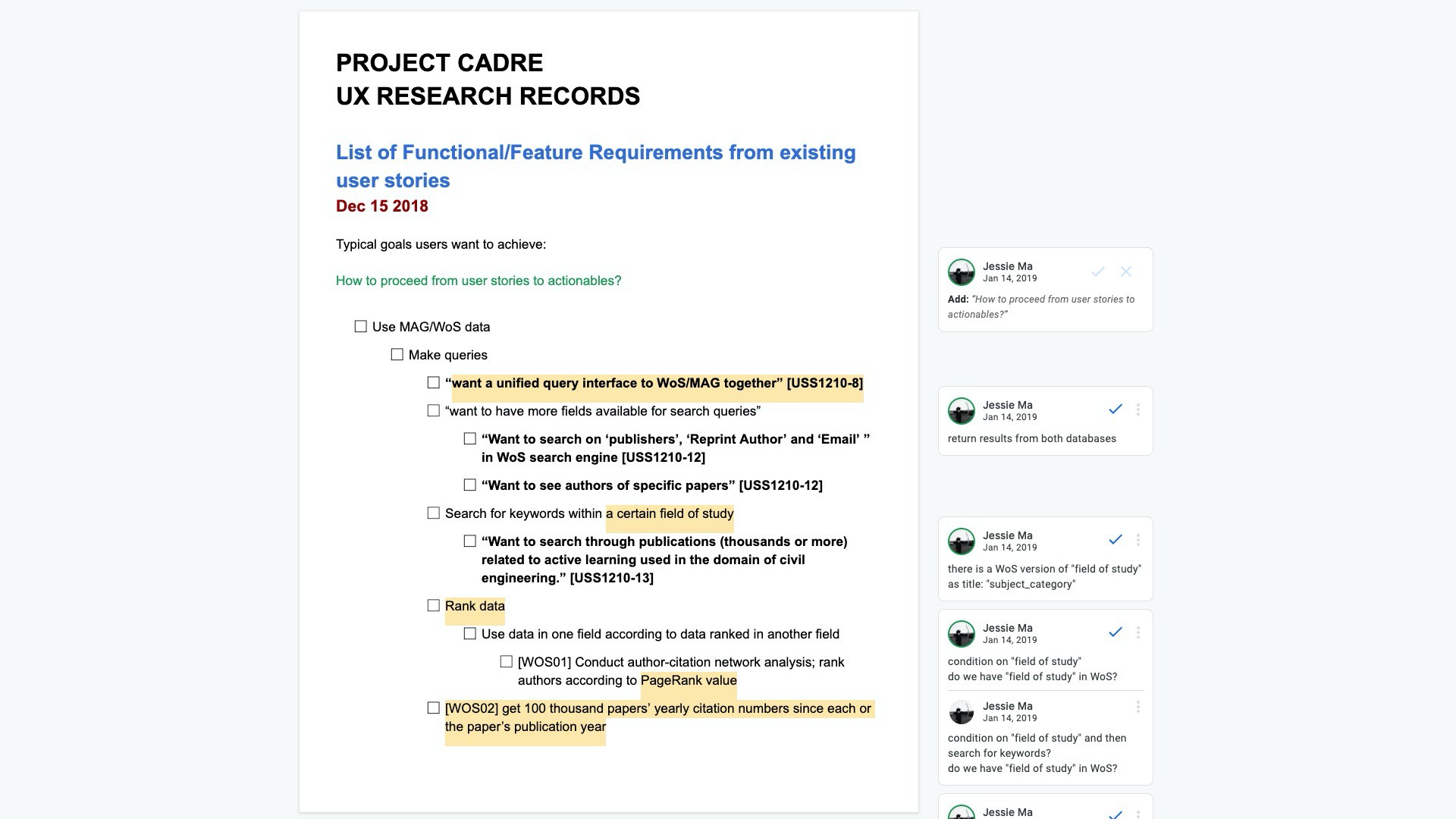
Over 30 collected stories were then further "distilled" and further broken down into more bare-bone functional requirements:
Designing CADRE
Laying down the structure
After many meetings and conversations, I created a preliminary structure diagram of CADRE:
(click on the image to view a full-resolution version)
This diagram was important to the team in the early stage of design and implementation and served the purposes of facilitating design discussions and keeping the whole team on the same page.
Wireframing and Prototyping
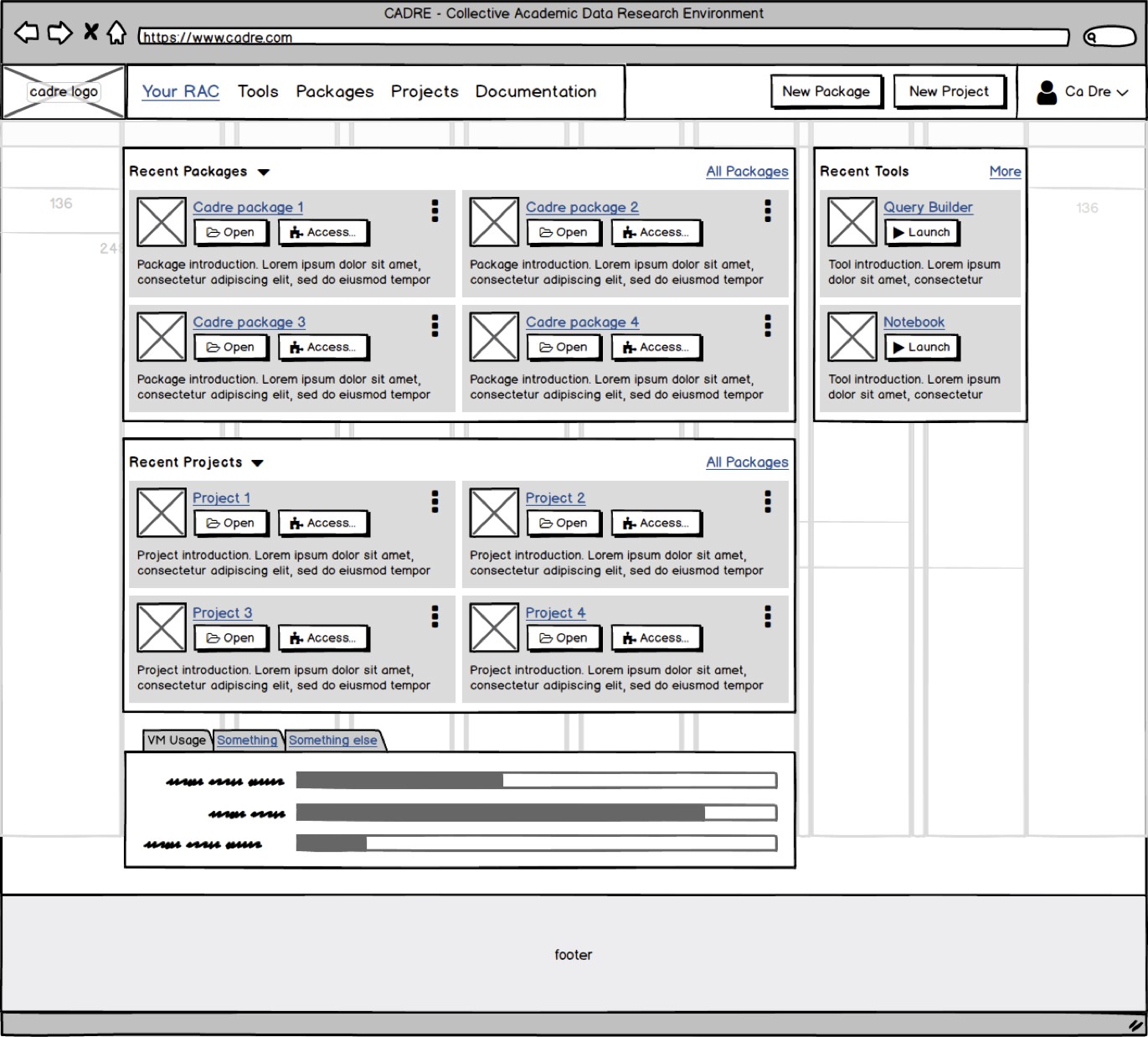
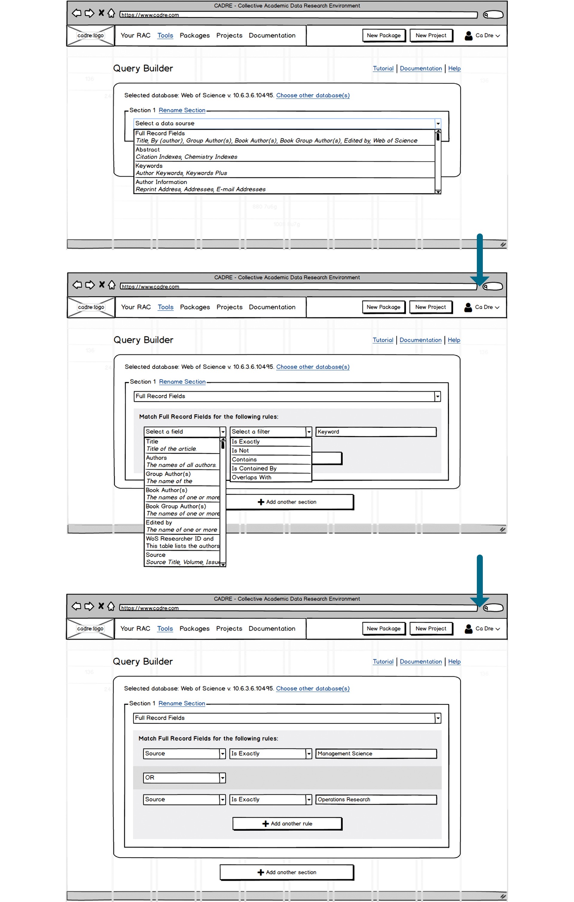
We decided to take creating the most important and central piece of CADRE - the Query Builder - as our first step. First version of query builder wireframes were created in Balsamiq:
Version 1 wireframe of CADRE dashboard. As shown in the wireframe, "packages", "projects" and "tools" are the three key types of entities in CADRE system, and this design remained until today.
Part of the Query Builder user flow. User selects the field to query, define the logical rules to match; multiple rules can be added. Allowing adding multiple section in one "query build" enables users to build data pipelines, instead of separated queries.
Designing the Official Website
From the Platform to the Website
For a while, our progress on the database management front was stagnant; available manpower was limited, yet various tasks - dataset cleaning, testing, selecting and verifying programming languages, database schemas and storage technologies, and so much more - all required huge amount of hours and attention. On the other aspect, as our team started to apply for research grants, attend academic conferences and events, and maintain conversations with more and more interested researchers who see potential in CADRE, a place where people can find information and learn about CADRE without having to talk to someone is increasingly needed. The team decided to put building the CADRE platform on hold, instead start creating CADRE's official website.
Sketching Up the Website
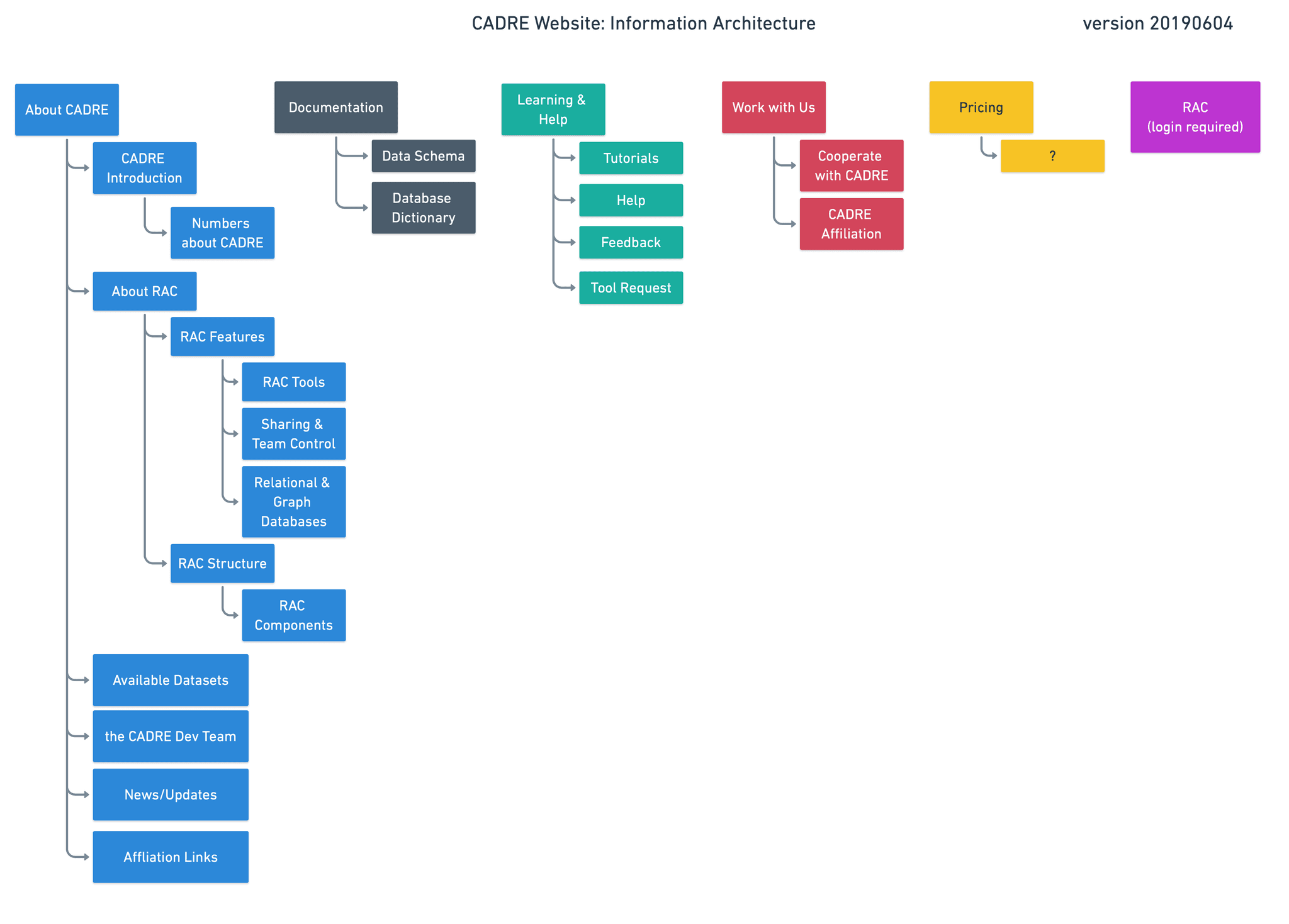
After finishing up the branding for CADRE, I put together Information Architecture for the new CADRE website:
Initial version of CADRE official Website's information architecture
Updated CADRE website information architecture after our last content update. White-outlined rectangles inside colored blocks = in-page content section; white-outlined round-tangles = functional component groups/accesses/links
Wireframes and different versions of mid-fi mockups were created:
From the left: lo-fi wireframe and two different trial versions of mid-fi mockups. The two different versions were used for A/B testing among team members to determine the most welcomed layout.
Multiple variations of the Events page were also made to test out text styles and scales, different layouts, and effectiveness of these layouts at displaying information: (click on each image to view it in full resolution)
The main Events page, version A
The main Events page, version B
The Event Detail page, version A
The Event Detail page, version B
The Event Detail page, version C
The Event Detail page, version D
Some more pages of the final design of the website.
Creating Illustrations for the Homepage
The team wanted to introduce some illustrations to the homepage to add to the visual aspect as well as serve as visual aids to help visitors understand some core concepts related to CADRE, such as the Marketplace, the Query Builder, and the datasets available through CADRE. I created the following set of isometric illustrations, the first three as individual pieces to accompany short introductory paragraphs to showcase features and selling points of CADRE, the fourth as the background of the hero/CTA section of the homepage.
Introduction illustration 1/3: the datasets CADRE provides access to
Introduction illustration 2/3: a visual implication of the Query Builder
Introduction illustration 3/3: the CADRE Marketplace
Hero/CTA section background illustration
The following diagram showed how these illustrations are used in the homepage.
The finishing bit of the web design stage for CADRE was marked by new designs that are consistent with the website for the CADRE platform, where our users log in to do their research. As you can see, when I took the screenshot, the platform was still largely under development, so most pages were still non-functional UIs without working back-end code.
How design changes were marked, communicated and checked between Ben and me in Zeplin
Making CADRE More Accessible
Accessibility Audit
From August to October 2020, before CADRE's Beta version was launched on Oct 23rd, the team conducted a major accessibility audit which greatly improved both CADRE website and platform's accessibility, with emphasis on several aspects, such as color contrast, facilitating easier structural navigation for Assistive Technology (such as screen readers) users, clearer visual hierarchy, and so on. I led the audit and did most of the work on the design side.
My methodology was simple, not as efficient as expected, but concrete: each and every page reachable within the cadre.iu.edu domain was visited then inspected with the WAVE plugin (https://wave.webaim.org/) for Chrome; all Errors, Contrast Errors and Alerts (see the screenshot below) are checked one by one, design updates/solutions were then created, aiming to address as many shown problems as possible. The corresponding design updates/solutions were then forwarded to our web developer, Ben, through Zeplin where each update/solution is mapped to the specific elements requiring changes on each page, for convenient review and quick pinpointing of problematic elements.
WAVE inspection result on a random webpage. Accessibility issues are categorized and the plugin would mark out each issue on the webpage.
Developer handoff, while not in full swing yet at this point, started in Zeplin. Zeplin is a great tool for developer handoff because it allows developers to view layered exports of screens as they are made in design tools such as Adobe XD and Figma while filtering out the complexity of having to navigate the design for the developers; any person with access to shared Zeplin projects can leave annotations and comments with visual indicators on the exported design, making communication involving designs much easier. The following is a screenshot of me leaving comments for our web developer in Zeplin.
How design changes were marked, communicated and checked between Ben and me in Zeplin.
Finally, as a summary to the completion of the accessibility audit, I put together a report showcasing all changes we made to the designs of the website and the platform.
Author's Note
Due to IUNI closing down, the report is no longer accessible. It was previously available online at https://cadre.iu.edu/resources/accessibility-report.
Reflections
One limit I had around working on this project was that I only worked part-time on it and I had to juggle schoolwork while working on this; I stopped working on this project due to my study, together with my my part-time job term, coming to an end at Indiana University, shortly after the pages I showed above were developed; at this point, the majority of the project was yet to be built. Having limited involvement on this project means I wasn't around to see its further development based on the few designs I made, or rather, how different the end product would be from how I, and the team, initially envisioned.
The prolonged timeline and reduced continuity of tasks I worked on for this project also made documenting the design process difficult; by the time I came around or was asked to make a change on something, it could have potentially be so long that I was no longer familiar with said piece of design or the context of it, or I don't remember enough about the information discussed regarding the design in meetings a few weeks or even months ago.
Next Steps
The following are several aspects that I can think of to further the design work for this project; most of them is unlikely to happen since the ownership of the project has been transferred to other organizations and research groups, IUNI has disbanded, and the team working on the project is largely different, meaning the focus, scope, and plan for this project could very much have changed.
I would like to update the design work I did for this project by using some of Figma's newer features such as components/component groups, component properties, variables, and logics/controls. At the time of this project, many Figma features were not released yet, causing the design file to be messier, having more redundancy, and less interactive (as in less interactive in the prototypes). The newer features, such as logic and variables, would be very useful in the context of this project, especially for prototyping the Query Builder section, since this section is very logic-heavy, and I believe having a psuedo-functioning prototype of the Query Builder would help a lot with verifying, testing its design before any code gets written, as well as facilitating quick usability tests to support better design decision making.
I would like to explore the possibility of adopting off-the-shelf design systems for the more detailed designs in this project. The rationale behind this consideration is that, after I left school and started working full-time, I learned that for projects with limited manpower, time, and budget, it's much more feasible and economic to at least make use of some design systems/libraries, such as Material Design, Ant Design, Fluent Design, Atlassian Design Language, Apple's Human Interface Guidelines, and many others. Since the development was still in very early stages at the time of me working on the designs, supporting development was not a major part of my work, thus whether to adopt a design system or not was not that much of a concern, but in reality, making the decision of adopting design systems could speed up development of a project on multiple levels.

